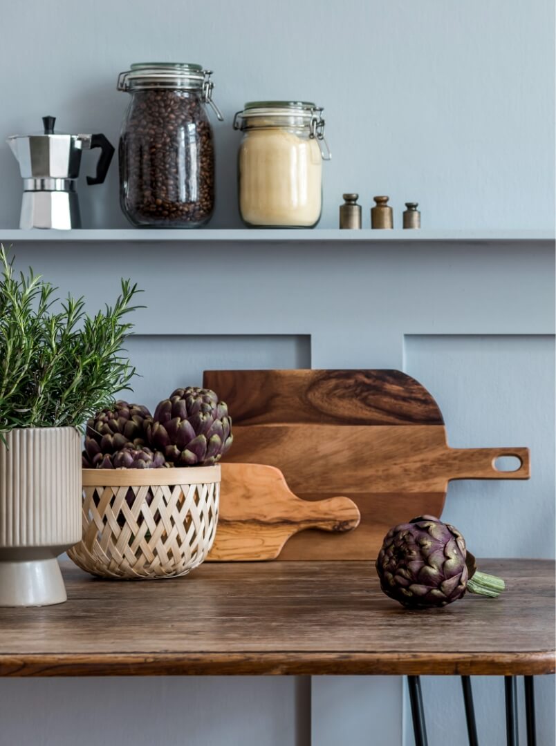
Veldrift
Named color
of the year 2025 by
our designers!
Trendy colour of the year
La couleur tendance de l’année
L’année 2025 marque un tournant, une quête d’équilibre entre authenticité et modernité. À l’aube de ce nouveau chapitre, un besoin collectif de sérénité et de connexion à l’essentiel émerge.
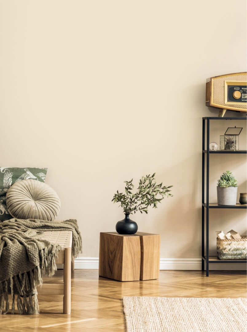
Veldrift, une teinte minérale subtilement chaleureuse, incarne cette aspiration. Inspirée par les paysages naturels et les textures organiques, elle apporte une touche de réconfort et d’élégance à chaque espace.
Symbole d’un retour à l’essentiel, Veldrift enveloppe nos intérieurs d’une douceur intemporelle, créant des atmosphères propices à la réflexion, à l’harmonie et au renouveau.
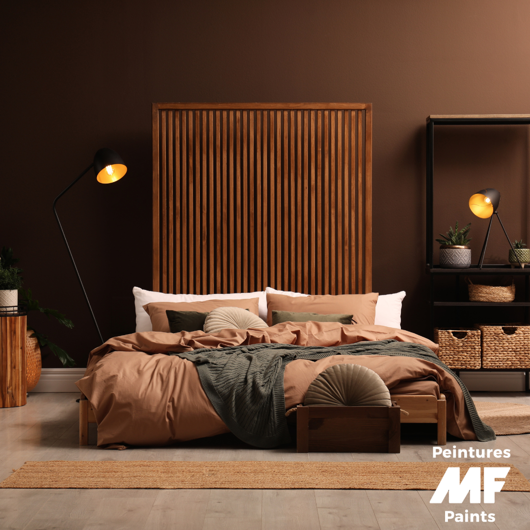
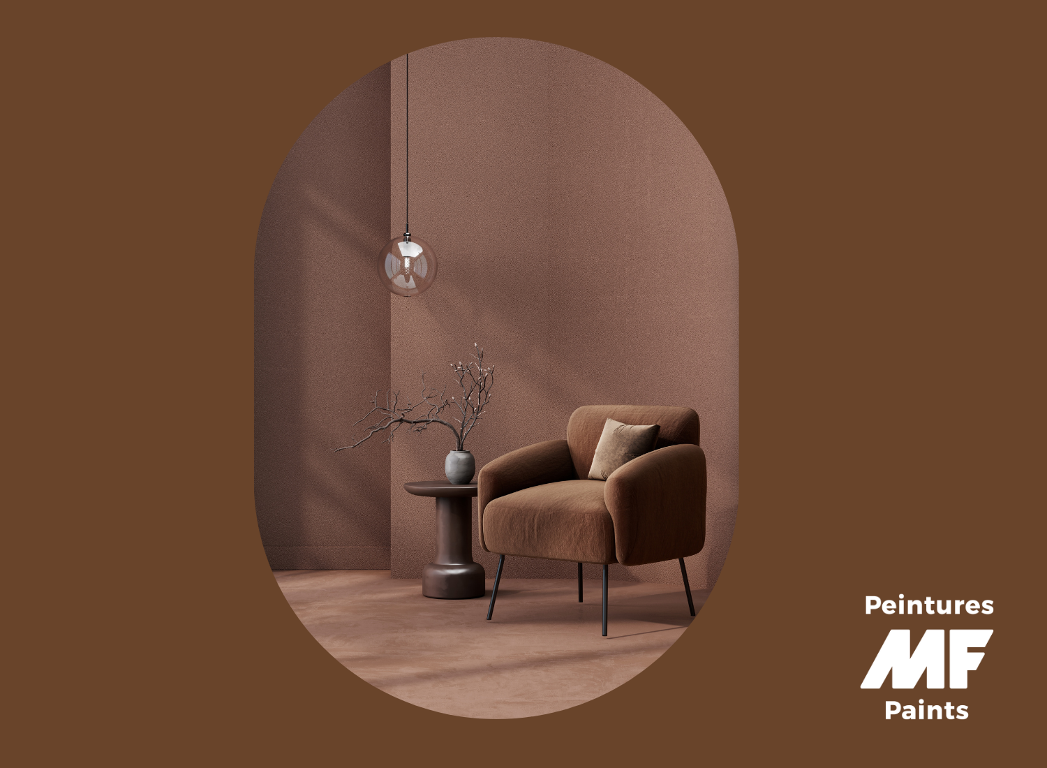
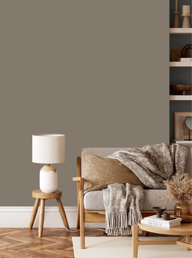
January: Colour of the Year Veldrift Brown
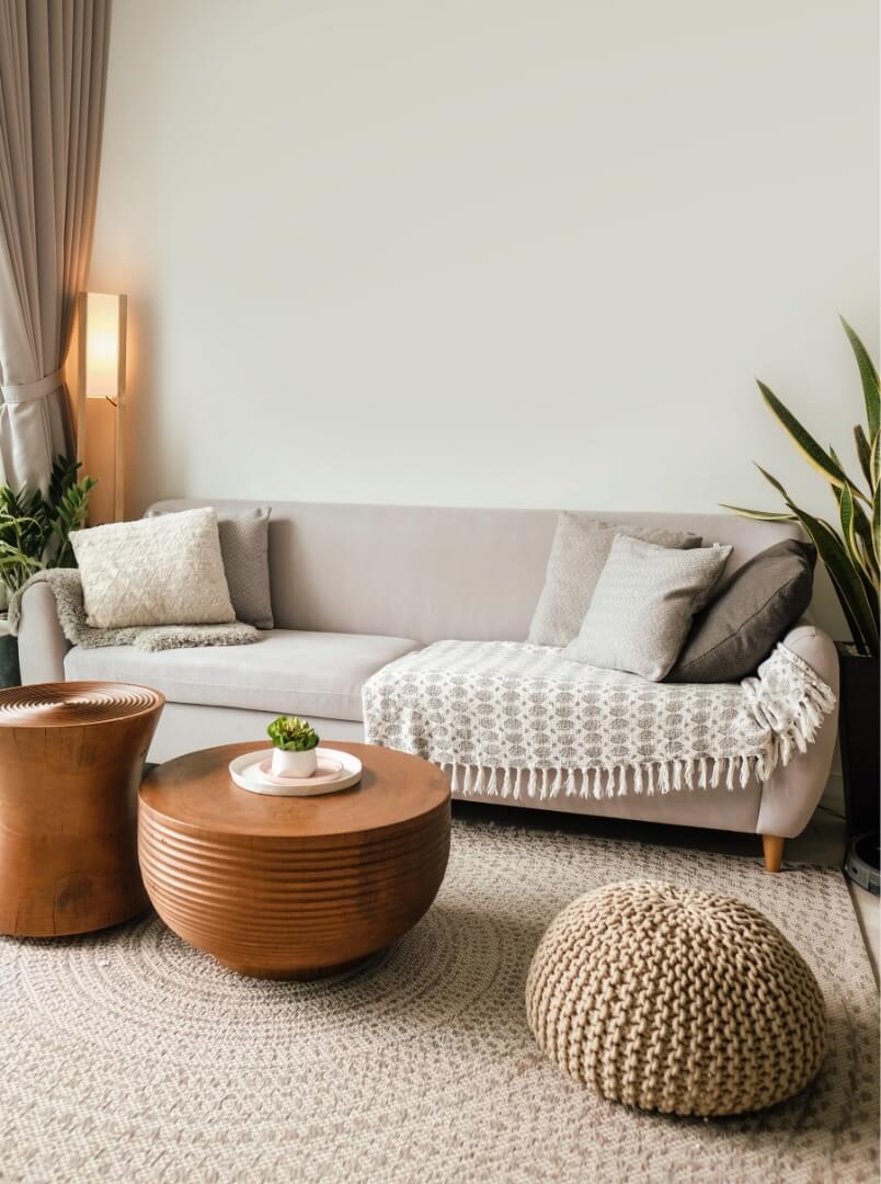
Warm, comforting and timeless, brown has not said its last word. Deep and enveloping like cocoa, soft and natural like beige or camel, it evokes stability and authenticity. Perfect for creating a soothing ambience, it goes wonderfully well with raw materials like wood or linen, and blends perfectly with touches of terracotta or gold for subtle elegance. It's a perfect choice for a cosy living room or an inspiring office, where it invites serenity and concentration!

Veldrift
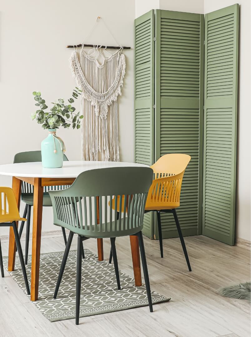
February: Belladonna leaf Green
Soothing, delicate and subtly sophisticated, this soft green has not said its last word. Halfway between natural and elegant, it evokes serenity and freshness while remaining warm. Perfect for creating a soft, comforting atmosphere, it goes wonderfully well with organic materials such as light wood, linen or touches of off-white and gold for a subtle harmony. It's perfect for a bright living room or a bedroom that's perfect for relaxation and well-being!
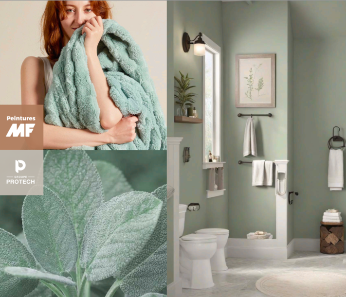
Belladonna's Leaf
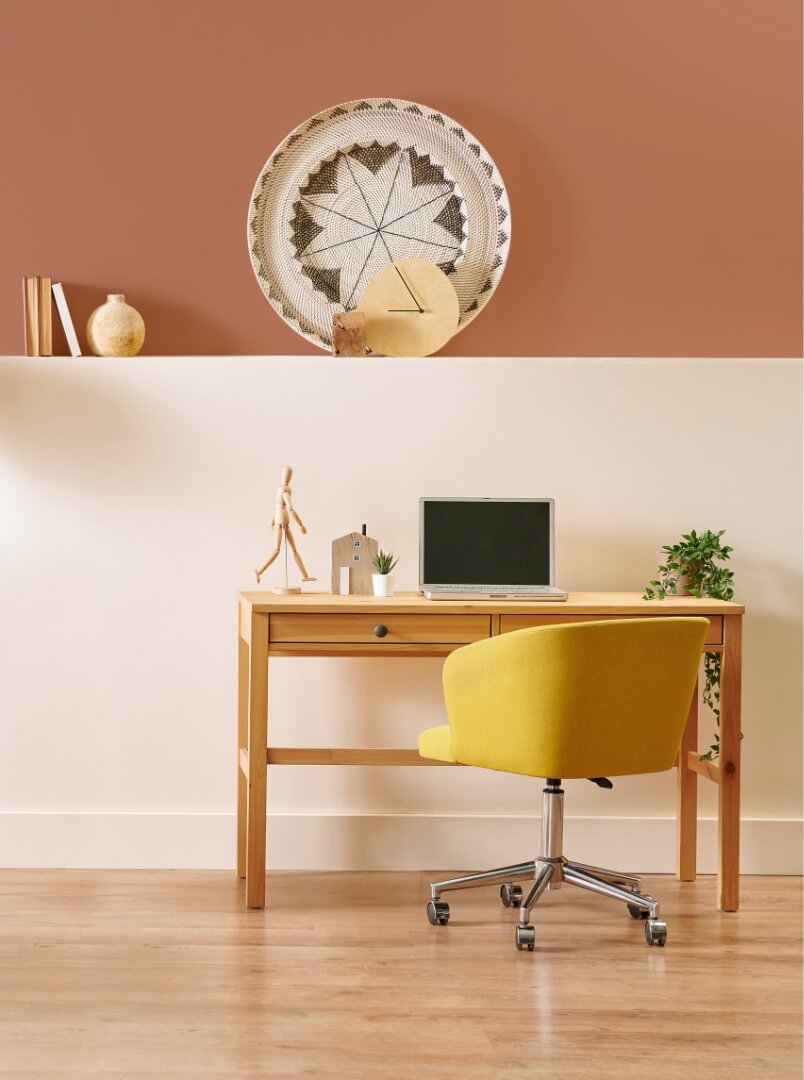
March: Coral Bay
Energetic, warm and resolutely trendy, coral berry has not said its last word. Between the softness of pink and the pep of orange, this vitamin-packed hue instantly infuses a space with cheerfulness and dynamism. Ideal for adding a sunny touch to an interior, it goes perfectly with neutral tones like beige or soft grey, but also dares to contrast with sage green or gold for a chic, modern feel. It's the perfect colour for a vibrant living room or inspiring office, where it invites creativity and good humour!
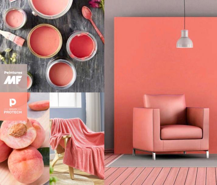
Bay Coral
April: Frozen blue
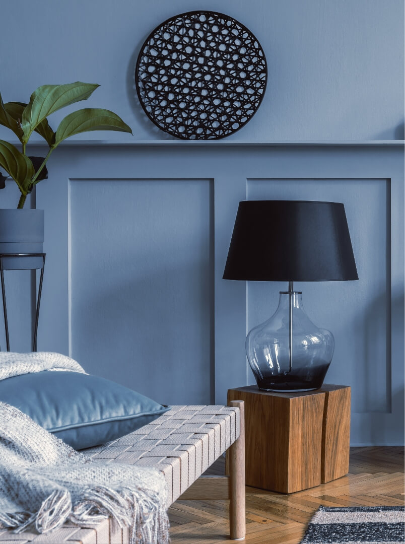
Icy, refined and serene, frozen blue has not said its last word. With its soft, airy hue, it evokes the purity of winter landscapes while remaining soothing and sophisticated. Ideal for instilling a feeling of freshness and elegance, it pairs harmoniously with neutral tones such as off-white or pearl grey, but is just as daring with touches of gold or light wood for a subtle contrast. It's a perfect choice for a bedroom or office, where it invites you to relax and think clearly!
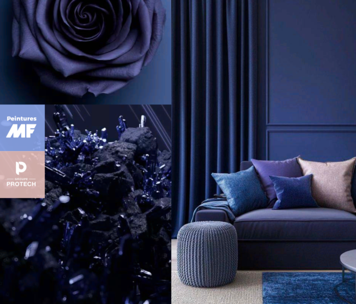
Frozen Blue
May: Fantastic pink
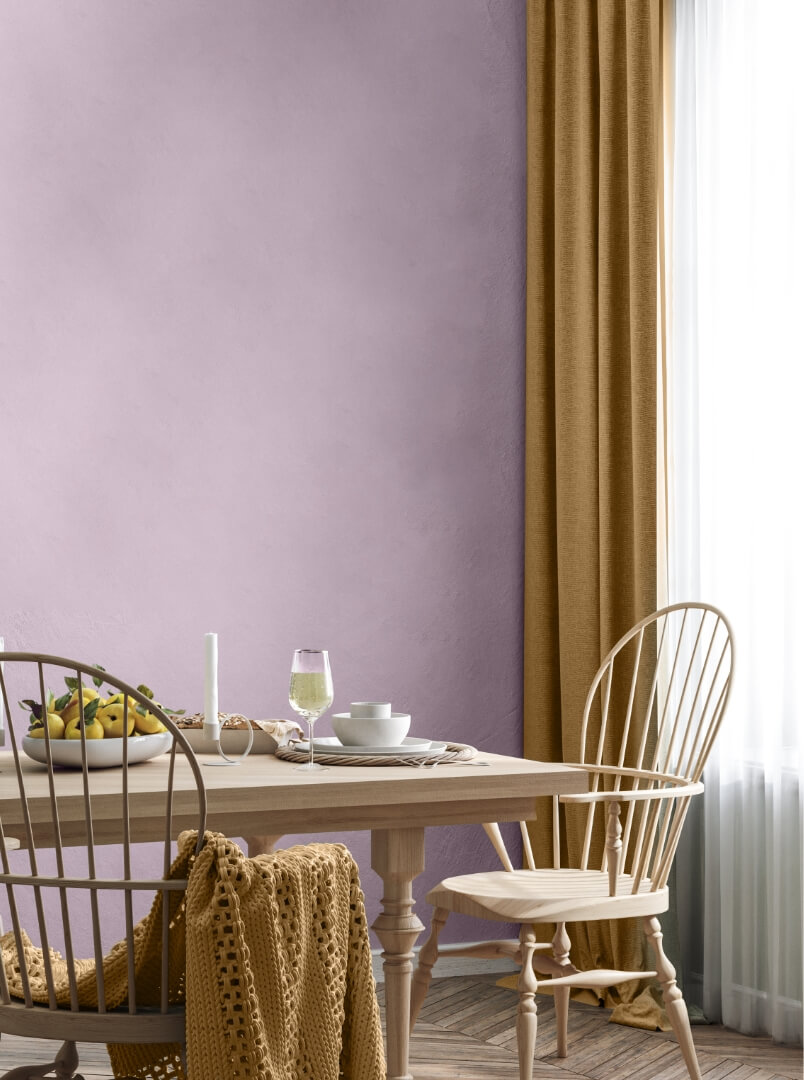
Vibrant, bold and bewitching, fantastic pink has not said its last word. Both modern and full of character, it breathes creative energy and a touch of fantasy into any space. Neither too soft nor too extravagant, it balances perfectly with shades of beige, light grey or touches of gold to create an elegant look. Ideal for livening up a living room or creating an inspiring atmosphere in an office, it's an invitation to optimism and uninhibited self-expression!
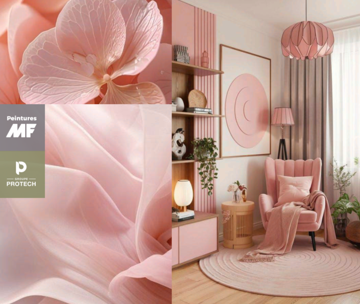
Fantastic Pink
June: Island breezes
Fresh, bright and exotic, the island breeze has not said its last word. Somewhere between turquoise and aqua green, this airy hue evokes the foam of the waves and the softness of tropical horizons. Ideal for instilling a feeling of lightness and well-being, it goes wonderfully well with sandy tones, pure white or golden accents for a touch of sunshine. You'll love it in a soothing bathroom or open-plan living space, where it's an invitation to escape and serenity!
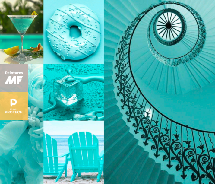
Island Breeze
July: Grilled cheese
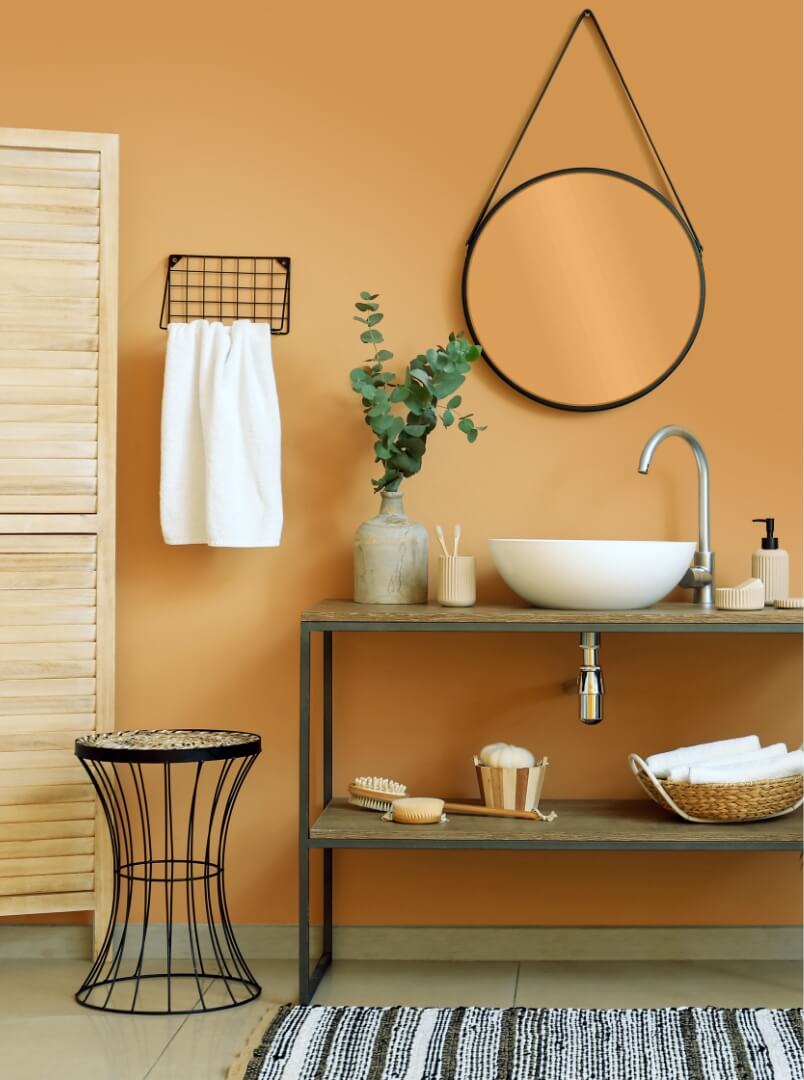
Warm, delicious and comforting, grilled cheese has not said its last word. Between sunny gold and caramelised orange, this hue evokes the sweetness of memories and the conviviality of shared moments. Ideal for warming interiors, it goes perfectly with earthy tones such as terracotta, spicy brown or touches of cream for an enveloping ambience. It's the perfect colour for a welcoming kitchen or cosy living room, where it's an invitation to good humour and relaxation!
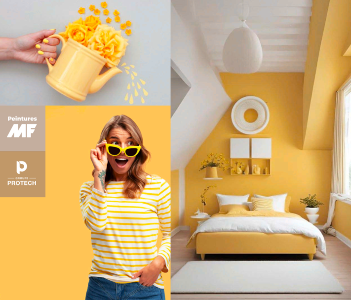
Grilled Cheese
August: Indian Tears
Elegant, modern and full of character, jet grey makes a refined statement. With its subtle depth and timeless allure, this shade oscillates between the strength of charcoal and the softness of anthracite grey. Ideal for structuring a space with sophistication, it goes perfectly with light shades such as off-white or beige, but also with metallic touches of gold or copper for a chic contrast. It's a perfect choice for a contemporary living room or a streamlined office, where it's an invitation to serenity and elegance!
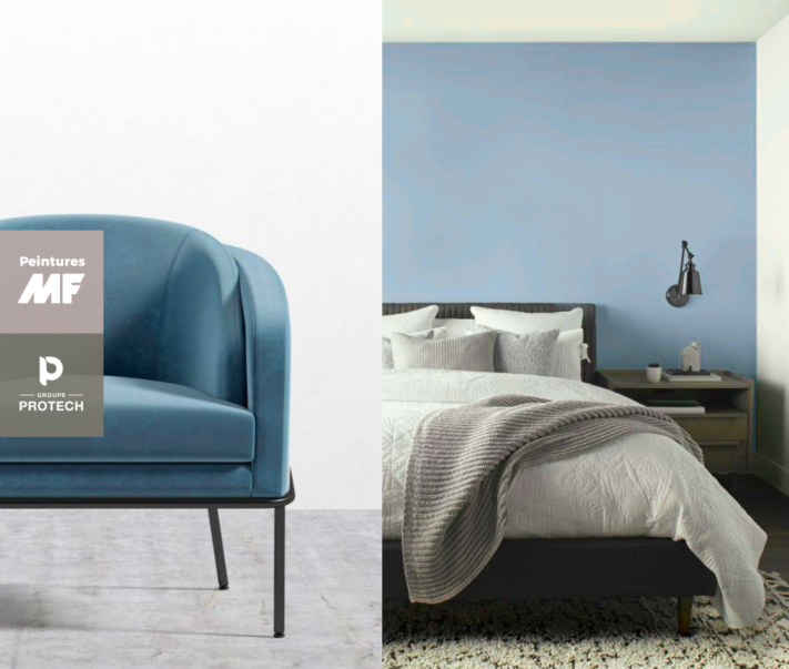
Indian Tears
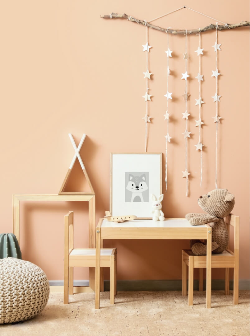
September: Japanese style
Warm, delicate and full of finesse, À la Japonaise evokes natural elegance and harmony. With its subtle balance between the softness of terracotta and the radiance of pink beige, it creates a soothing, refined atmosphere. Perfect for warming up an interior, it works wonderfully with neutral tones such as ecru or pearl grey, but also with light wood and golden brass accents for a sophisticated touch. Ideal for a welcoming living room or cosy bedroom, it's an invitation to serenity and escape. Adopt it without hesitation for inspired, timeless decor!
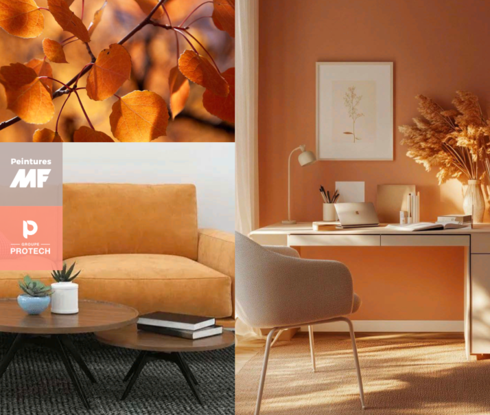
Japonica
October: Obsessive
Deep, sophisticated and full of character, Obsessionnel embodies timeless elegance. Rich and velvety, this shade oscillates between the passion of red and the depth of brown, creating a hushed, refined atmosphere. Ideal for adding a touch of luxury to any interior, it pairs perfectly with soft shades such as beige or pearl grey, but also with gold or black accents for a bold contrast. In a chic living room, an elegant dining room or even a cosy bedroom, Obsessionnel invites intimacy and sophistication. A noble and bewitching choice!
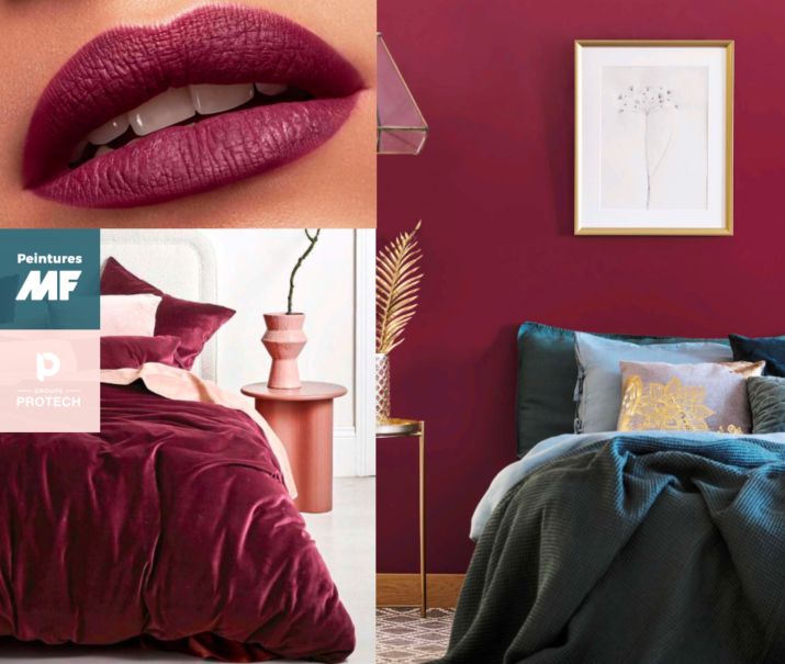
Obsession
November: Follow the leader
Follow the leader, a soft earthy gold, embodies the gentle warmth and light of late autumn. Its understated elegance creates serene, grounded spaces, perfect for warm gatherings and quiet moments. Blending perfectly with slate blues, muted terracottas and natural textures, Suivez le chef adds an inviting glow to walls, fabrics and accents. Appreciated for its soothing, timeless appeal, this colour invites us to slow down, savour the season and bring the golden light of autumn into our daily lives.
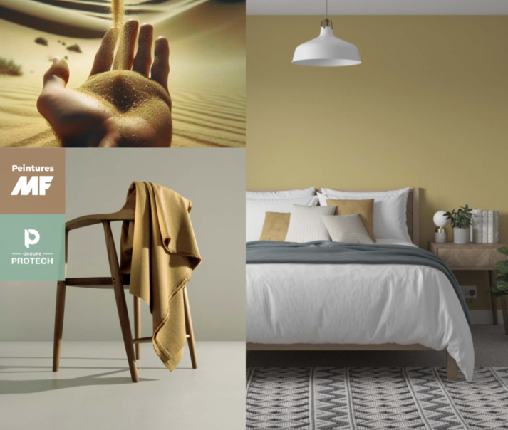
Follow the Leader
December: Arizona stone
Arizona Stone, a rich, serene green with deep shades of teal, embodies the tranquillity and mystery of nature at its most bewitching. Whether used on accent walls, upholstery or decorations, Arizona Stone imbues spaces with a sense of sophistication and balance. It blends beautifully with warm metals such as brass or gold, soft ivory tones and muted jewel tones, creating a palette that is both modern and classic. Arizona Stone reflects the spirit of renewal and reflection of the season. It's more than a colour-it's a connection to the quiet beauty of nature and a statement of timeless elegance.
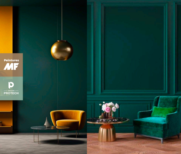
Arizona Stone
Find the retailer closest to you!
Find a retailerSimple Serenity
